Colour psychology holds the key to homely hygge heaven
22/12/2016
THE DANISH call it getting ‘hygge’ (which is pronounced more like hugger than higgy) – creating that quality of cosiness and contentment in the home.
Designing this nest of warmth is never more relevant than in the cold winter months, yet there’s more to hygge than candlelight and cake. Colour on our walls – whether it be vibrant or calming – can play a central part in keeping those winter blues at bay.
Here the colour experts from Crown Decorating Centres share their knowledge of how to navigate a path to the perfect personal colour palette.
What’s hygge home heaven for one is another’s nightmare. For some the design theme is minimalist while for others clutter and home comforts are the order of the day. The connection for both is the right choice of colour and execution of the design to achieve that all important individual feel.
So understanding the psychology of colour is a great starting point in choosing the right hues to suit your needs and personality.
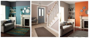
Explains Crown’s colour specialist Kathryn Lloyd: “As a general rule social spaces suit warmer colours, whereas quiet areas suit cooler, calmer colours to help focus or calm the mind.
“Reds, oranges and yellows are identified as warm colours which have been known to increase rapid eye movement and blood pressure.
“Warm colours are good for promoting activity, conversation and stimulating appetite as well as being attention grabbing. Warm colours can trick the mind into thinking a space is warmer than it actually is and can create a cosy atmosphere, or be used in cold places to warm them up.
“Personality type can determine how a person responds to warm and cool colours. Some may find warm colours overpowering while others may find cool colours cold and unappealing.
“Blues, aquas and some greys are seen as cool colours. Some blues (more towards purple) can be quite warm and are generally known for their calming characteristics. They can be beneficial for solitary thought which makes them particularly suited to study areas and bedrooms.
“Blue is not a colour associated with foods – it’s never seen in nature so pure blue doesn’t stimulate the appetite and therefore would not be the most obvious choice to use in a dining room.”
Colour confidence does not come easily to everyone so for many modern homeowners, the neutral palette of white, greys, creams or stones are a great starting point to form the base for a co-ordinated home.
Adds Kathryn: “Neutral colours consist of minimal colourants and can therefore act as a perfect blank canvas. A neutral colour scheme is least likely to offend anyone because of its impartiality; colour is an emotional subject and neutrals are a safe common ground. You will often find neutrals used in hotels for this reason.
“Creating interest and adding depth to a neutral colour scheme is simple – just vary the texture and tone of your colours and go to town with textured accessories.
“If neutrals are your preference, then selecting a range of monotone colours – which come from the same colour group but vary tonally – gives rise to a scheme which is very easy on the eye and can create a soothing effect.”
“And don’t forget personalising any colour scheme in the home is simple – every local Crown Decorating Centre can create paint colours to match any object – a favoured household item, a cushion, rug or even curtains.”
For more colour trends information and advice talk to the team at your local Crown Decorating Centre. There are 135 stores nationwide – visit www.crowndecoratorcentre.co.uk to find your nearest store.