Rich tones on the style radar this Autumn
10/10/2019
TRADE ASSOCIATION PR
Colour experts have singled out 12 show-stopping shades set to enrich homes across the UK this autumn.
The season’s on-trend colour palette will include rich tones and neutrals with a twist.
For householders planning to update their interiors, colour is key to creating a stylish new look.
The Pantone Color Institute, a consulting service that forecasts global colour trends, has predicted 12 stand-out colours set to dominate autumn, as well as a new twist on four classic neutrals.
Olives, deep blues, frosted greys and golden yellows are among some of the go-to colours which will mark the season.
Belinda Halpenny, a member of the Painting and Decorating Association – Britain’s largest trade body dedicated to the painting and decorating trade – has been in the sector for more than 20 years, working for her family business, Cambridgeshire-based Graham Halpenny Decorators.
Throughout her career she has worked closely with interior designers and developed a keen eye for colour.
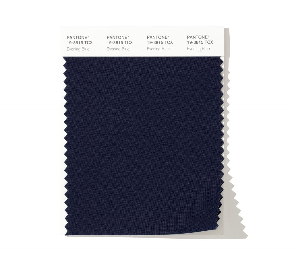
She says: “We have seen a real upsurge in dark blues, and these make a smart contrast with white and neutral colours.
“Evening Blue is a great choice for a feature wall to help make a statement or even for kitchen units with white marble tops to compliment.
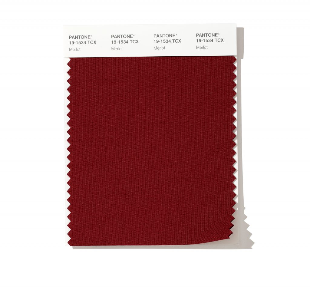
“If you are looking for a rich and indulgent colour, try Merlot. This works well as a backdrop for statement artwork or used on a stairwell for a bold entrance.
“Alternatively, create a modern industrial theme by using it alongside concrete or reclaimed oak. It’s also a natural colour for a chimney breast and is a real winter warmer.
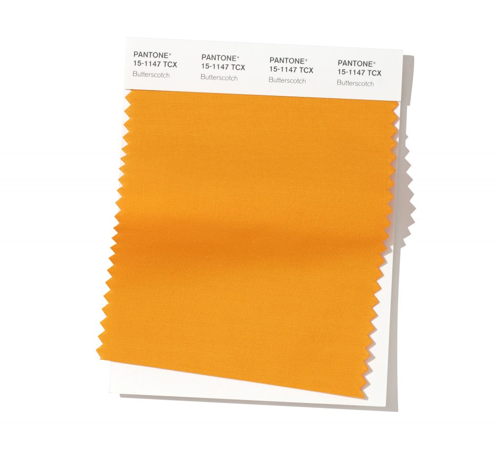
“Butterscotch is not for the faint hearted, instead for the boldest and bravest, but the reward is having a totally unique look. It can really brighten a room and works best with plenty of natural light and deep, moody blue and grey accessories.”
The rich tones are striking for an entire room, but for those who are more cautious with colour, Belinda recommends starting with a new hue as a feature wall.
She says: “See how it feels, and if you love it, great! If it feels a little overwhelming, simply choose a neutral to complement.
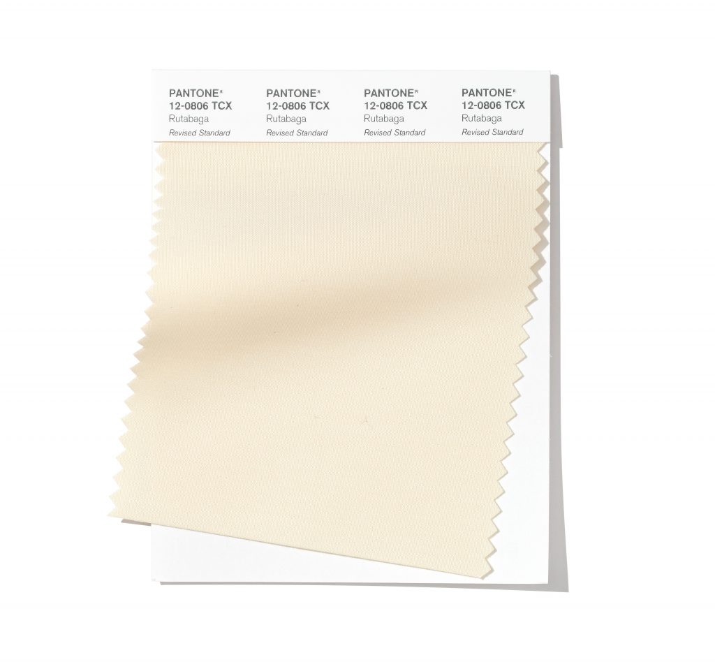
“Rutabaga is an amazing neutral. Why not try it on your ceiling, woodwork or architectural features for a sophisticated feel?
“There are so many tools and resources out there to help you choose the right colour and provide you with ideas, but if you’re not brave enough to use statement paints, choose a complementary neutral and just add a pop of colour with cushions, a throw or accessories. Whatever you do with colour in your home, enjoy it.”
Many paint companies offer expert advice from a colour consultant who will organise a home visit and create a bespoke colour scheme.
However, like Belinda, qualified and experienced painters and decorators can also provide help and advice when it comes to choosing new shades for your home.
Belinda added: “Ask your decorator whether they offer a colour consultation. Have fun yourself with the samples, paint them onto lining paper and move them to all areas in all lights at different times of the day.”
For a trusted route of finding tradespeople look out for the red, white and blue logo of the Painting and Decorating Association (PDA).
To find a painter and decorator in your area, go to https://paintingdecoratingassociation.co.uk/find/

No comments yet.